
Genobrand™ vs Traditional Branding Comparison (2026)
Genobrand™ vs Traditional Branding Comparison (2026)
Genobrand™ vs Traditional Branding Comparison (2026)
Understand how Genobrand™ differs from traditional branding. While traditional branding creates visual identity (logos, colors), Genobrand builds behavioral identity. See why decoration isn't architecture.
Understand how Genobrand™ differs from traditional branding. While traditional branding creates visual identity (logos, colors), Genobrand builds behavioral identity. See why decoration isn't architecture.
Understand how Genobrand™ differs from traditional branding. While traditional branding creates visual identity (logos, colors), Genobrand builds behavioral identity. See why decoration isn't architecture.
Compare the frameworks

Genobrand™ vs Traditional Branding: The Complete Comparison (2026)
The $50,000 Question Nobody Asks
Let's start with the good news: you probably haven't spent $50,000 on a "rebrand."
Most business owners haven't. Most never will. And after reading this, you'll understand why that might be the best money you never spent.
But plenty of companies have. They invested $50,000, sometimes $100,000 or more, and walked away with a stunning new logo. A sophisticated colour palette. A comprehensive brand guidelines document that details exactly how to use their typography system. A website that looks incredible. Business cards that are chef's kiss.
And here's the question nobody asked them, and nobody's asking you:
Did any of that help anyone make a decision?
Did it tell the customer service rep how to handle an angry customer? Did it clarify what the company actually stands for? Did it give the sales team confidence in pricing conversations? Did it provide a behavioural standard for when things go wrong?
The honest answer? Probably not.
Because what they bought wasn't a brand. It was decoration. Beautiful, professional, necessary decoration. But decoration nonetheless.
Here's the uncomfortable truth that could save you tens of thousands of dollars: most businesses confuse branding with visual identity. They think if they look professional, they are professional. If they sound cohesive, they are cohesive. If their mood board inspires, their business will inspire.
But looking like a brand and being a brand are two completely different things.
And if you don't understand the difference before you invest, you'll either waste money you don't have, or worse, build something that actively works against you when you try to grow.
Traditional branding gives you the costume. Genobrand™ gives you the character.
In this comparison, we'll explore what traditional branding actually delivers. It's not worthless. It's incomplete. We'll identify the critical gaps that no amount of design can fill. And we'll show how Genobrand™ builds behavioural identity from the inside out, creating a foundation that visual identity can finally express authentically.
Prefer to watch? This video covers the key differences:
What Is Traditional Branding?
When most people say "branding," they're referring to the process developed by design agencies, marketing firms, and brand consultancies over the past half-century.
Traditional branding isn't a single methodology created by one person. It's an industry practice. A collection of deliverables that have become standard across thousands of agencies worldwide.
Traditional branding typically focuses on:
Visual Identity
Logo design
Colour palette
Typography system
Design elements and patterns
Verbal Identity
Tagline or slogan
Tone of voice guidelines
Key messaging
Mission and vision statements
Brand Guidelines
Logo usage rules
Colour specifications (HEX, RGB, CMYK, Pantone)
Typography hierarchy
Spacing and composition rules
Do's and don'ts
Marketing Collateral
Business cards
Letterhead
Website design
Social media templates
Presentation templates
The typical process involves discovery (stakeholder interviews, competitive analysis, mood boards), strategy (positioning, messaging, personality traits), design (logo concepts, colour exploration, visual systems), refinement (revisions, feedback, final polish), and delivery (brand book, file package, rollout plan).
Timeline: 8-16 weeks. Investment: $10,000-$100,000+ depending on agency.
What Traditional Branding Does Exceptionally Well
Let's be direct: traditional branding isn't useless. Agencies that specialize in visual identity provide genuine value. Here's what they get right.
1. Creates Professional Appearance
A well-designed logo, thoughtful colour palette, and cohesive visual system make your business look legitimate, established, and trustworthy.
Why this matters: First impressions count. Professional design signals that you're serious about your business. A tech startup with amateur design will struggle to raise funding, even if their product is excellent. Investors make judgments based on perceived professionalism.
2. Provides Creative Consistency
Brand guidelines ensure that your website, social media, business cards, and presentations all feel cohesive. This consistency builds recognition over time.
Why this matters: When your visuals are inconsistent, people can't remember you. Consistency creates familiarity, and familiarity builds trust.
3. Differentiates Aesthetically
In crowded markets, distinctive visual identity helps you stand out. A unique logo, unexpected colour palette, or signature design element makes you memorable.
Why this matters: If you look exactly like your competitors, you become invisible. Visual differentiation is the first step to being noticed.
The bottom line: If your problem is "we look unprofessional and inconsistent," traditional branding is an excellent solution.
Where Traditional Branding Stops Short
Now let's ask the honest questions about what traditional branding was never designed to address.
How does your brand book help you hire the right people?
When you're interviewing candidates, what does your colour palette tell you to look for? How does your typography system help you evaluate cultural fit? What questions should you ask to ensure a new employee will reinforce what your company stands for?
Traditional branding doesn't address this because it's a visual identity system, not an operational one.
What does your logo tell you about handling an angry customer?
When something goes wrong, and it will, what guidance does your brand book provide? How should your team respond? What experience should the customer have, even when they're upset?
Your brand guidelines probably have extensive rules about logo clear space. They probably say nothing about behaviour under pressure.
How does your visual identity guide product decisions?
When you're deciding which features to build, which markets to enter, or which partnerships to pursue, how does your colour palette inform that choice?
It doesn't. Because visual identity and business identity are different things.
What happens when visuals are consistent but experience is not?
You can have perfect logo usage across every touchpoint while delivering wildly inconsistent customer experiences. The website looks professional. The service feels amateur. The aesthetic coheres. The behaviour doesn't.
This is the gap traditional branding cannot address. Across hiring, customer service, product decisions, and the experience you actually deliver, your brand book has nothing to say. Not because the agency that built it failed. Because that's not what brand books are for.
The Five Critical Gaps
1. Decoration ≠ Architecture
Traditional branding decorates the surface without building the structure underneath.
Think about a house. You can choose beautiful paint colours, elegant furniture, and stunning artwork. But if the foundation is cracked, the walls are weak, and the roof leaks, all that decoration is meaningless.
Traditional branding is interior design. Genobrand™ is structural engineering.
2. No Behavioural Standards
Traditional brand guidelines tell you how your logo should look, but they don't tell you how your business should behave.
Example from traditional brand guidelines:
"Use logo with 20px minimum clear space"
"Primary colour: #2C5F8D"
"Tone of voice: Professional yet approachable"
What's NOT in traditional brand guidelines:
How do we demonstrate "professional yet approachable" in customer service?
What does our identity look like when we make a mistake?
How do we prove our values in our pricing strategy?
Without behavioural standards, "professional yet approachable" is just a mood board adjective, not an operational reality.
3. Outside-In Thinking
Traditional branding begins with external perception: How should we appear?
Genobrand™ begins with internal truth: Who are we structurally?
The problem with outside-in thinking is that you're building an image to project, not an identity to live. One designs to impress. The other designs to express.
4. Visual Identity ≠ Identity
Your logo is not your identity. Your colours are not your identity. Your typography is not your identity.
Those are visual expressions of identity. But they aren't the identity itself.
Because traditional branding produces tangible deliverables (logo, brand book, templates), people mistake these artifacts for the identity itself. But identity is behavioural. Visual identity is just the costume identity wears.
5. No Proof System
Traditional branding creates the claim. It doesn't create the proof.
What traditional branding delivers:
"We're innovative" (tagline)
"We're trustworthy" (visual sophistication)
"We're friendly" (warm colour palette)
What it doesn't deliver:
How do we systematically demonstrate innovation?
What experiences prove we're trustworthy?
What behaviours make customers feel we're friendly?
The gap is between what you claim visually and what you prove behaviourally.
The Branding Delusion: Aesthetic = Identity
Why does traditional branding persist if it's incomplete?
Because it's tangible, impressive, and easy to sell.
You can show a client a logo. You can present a colour palette. You can deliver a brand guidelines PDF. These are concrete, measurable deliverables that justify a budget and look great in a portfolio.
Behavioural identity is harder to sell because:
You can't put it in a PDF
It requires cultural change, not just design polish
The results compound over years, not weeks
It demands organizational commitment, not just marketing buy-in
So agencies default to what's sellable: decoration.
And clients, not knowing better, assume that decoration is the brand. They think:
"If we look professional, we are professional"
"If we have a logo, we have a brand"
"If we spent money on it, it must be complete"
But looking the part and being the part are completely different.

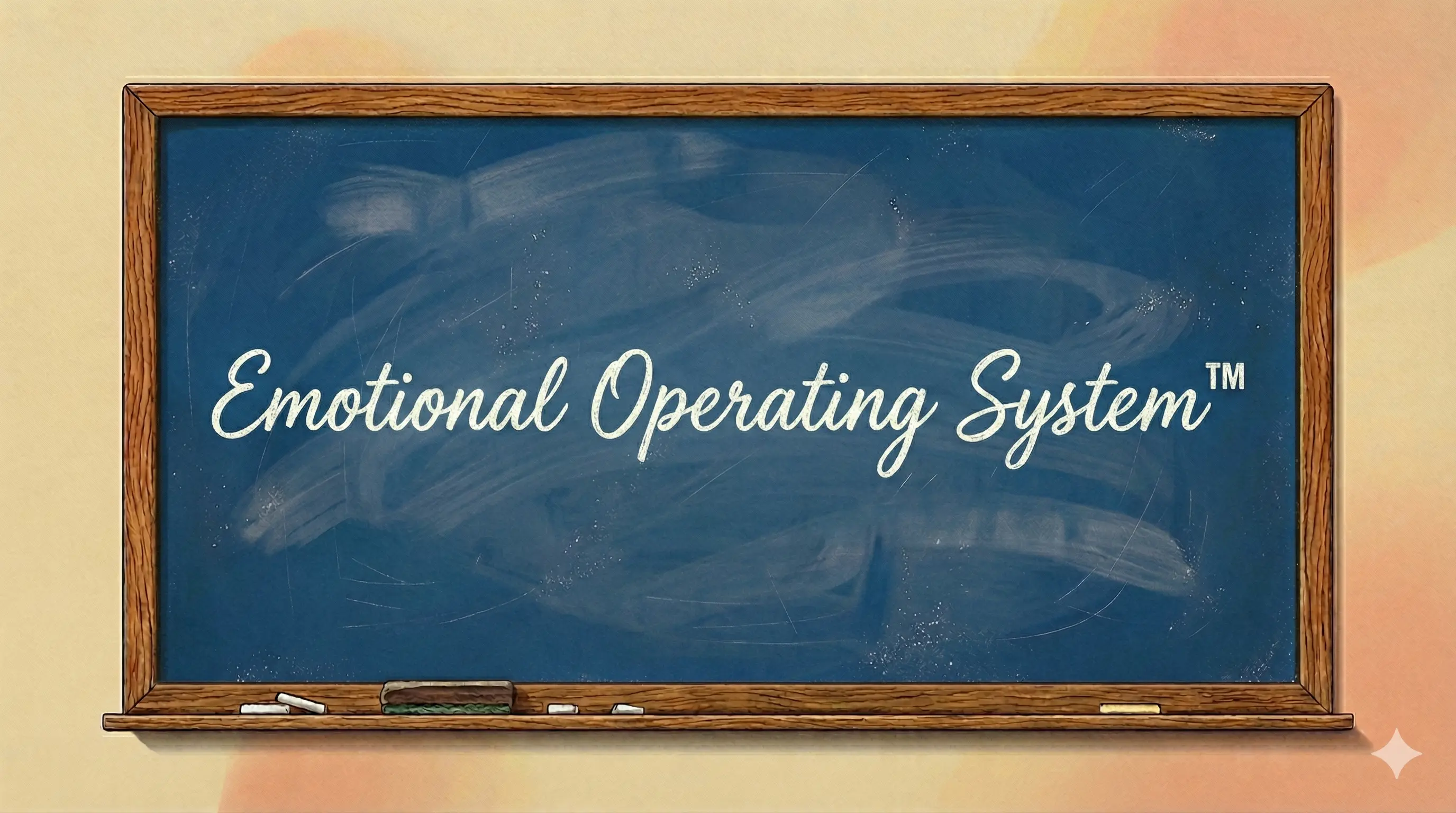
The Emotional Operating System™
This is what Genobrand™ actually produces. It's categorically different from what any traditional branding agency delivers.
A Genobrand is the emotional infrastructure that determines how an organization behaves and how people feel about it over time. But infrastructure alone is just a concept. It needs a system to make it operational.
The Emotional Operating System is that system. It's the internal architecture that turns a Genobrand from idea into reality. It guides decisions, ensures consistency, and creates the connection that visual identity cannot manufacture.
At the core of the Emotional Operating System is the Attention Formula™:
(Purpose + Promise) × Proof = Lasting Emotional Connection
Purpose (Core Purpose Statement™)
Where traditional branding gives you a mission statement that lives in a drawer, Purpose in Genobrand is a specific, ownable belief that your organization and audience share together. Expressed in 2-7 words. Not a decorative statement. A rallying cry that guides decisions.
Promise (Transformational Promise Statement™)
Where traditional branding gives you a tagline, Promise in Genobrand is the specific transformation customers experience. Not a vague claim, but a measurable change in their lives.
Proof (Emotional Touchpoints™ & Receipts™)
This is what traditional branding lacks entirely. The systematic behavioural evidence that validates your Purpose and Promise through consistent action at every touchpoint. Not what you claim to be, but what you demonstrably are.
The multiplication sign is critical. Without Proof, everything equals zero. You can have the most beautiful visual identity in the world, but if your behaviour doesn't prove it, you've built nothing.
The Emotional Operating System also includes the Genobrand Story™. It's the complete narrative framework that communicates your Purpose, Promise, and Proof in a way that invites people to belong.
This isn't a document that informs your creative team. It's operational infrastructure that guides behaviour across your entire organization.
How do you hire? Look for candidates who genuinely believe your Core Purpose. Skill is teachable. Belief is not.
How do you handle customer complaints? Treat the response as an Emotional Touchpoint. The complaint itself is forgettable. How you respond becomes part of what you're known for.
How do you make decisions when facing uncertainty? Use the emotional infrastructure as the guide. Most businesses default to gut feeling or hope. The Emotional Operating System replaces both with reasoning you can actually defend.
The Emotional Operating System isn't appearance you maintain. It's identity you prove. Through action, at every touchpoint, over time.
What We Can Observe: Real Companies
Let's look at how these two approaches play out in observable reality.
Nike
What traditional branding sees:
Nike has a distinctive swoosh logo. Their colour palette is bold. Black, white, and accent colours that pop. Their typography is strong and athletic. Their visual identity is instantly recognizable worldwide.
What Genobrand™ sees:
"Just Do It' isn't a tagline. It functions as a belief system. Action over hesitation. And critically, this applies to everyone. Not just elite athletes. Anyone facing a moment of decision.
What we can observe: Nike makes regular people feel like athletes. The person buying Nike shoes to walk to work is accessing the same emotional promise as a marathon runner. Their campaigns challenge everyday people to act, not just professional athletes. They've taken stands on social issues (like the Kaepernick campaign) that prove 'Just Do It' extends beyond sports. Kaepernick acted despite consequences, Nike backed him despite backlash. Purpose proved through behaviour.
The observable difference: Nike could change their logo tomorrow and still be Nike. Because whatever infrastructure they've built operates at a deeper level than visual identity. Their consistency isn't aesthetic. It's behavioural.
Apple
What traditional branding sees:
Apple has a minimalist aesthetic. Clean lines, white space, elegant typography. Their visual identity communicates sophistication and simplicity.
What Genobrand™ sees:
"Think Different" functions as a belief system, not just a marketing position. The conviction that challenging convention produces breakthrough innovation appears to run through everything Apple does.
What we can observe: Product design that prioritizes elegance over spec sheets. Retail stores that feel like museums. Packaging that's worth keeping. Customer service that treats people as intelligent. Every touchpoint reinforces the same message.
The observable difference: Apple's logo and colour palette don't explain why opening an Apple product feels like an event. That feeling comes from behavioural consistency, not visual consistency.
McDonald's
What traditional branding sees:
Golden arches. Red and yellow colour scheme. Consistent visual presence across tens of thousands of locations worldwide.
What Genobrand™ sees:
"I'm Lovin' It" offers something beyond food. Permission to enjoy without pretension. It's not about what you're eating. It's about how you're allowed to feel while eating it.
What we can observe: Identical experiences in Tokyo and Toronto. The same fries whether you're in a suit or work boots. Billions invested in operational systems that deliver consistency across tens of thousands of locations.
The observable difference: McDonald's visual branding is consistent. But what makes people return isn't the golden arches. It's the predictable experience. That predictability is behavioural infrastructure, not graphic design.
When to Use Each
This is simpler than it might seem.
If your goal is to professionalize your appearance:
Traditional branding delivers. You need a logo, colour system, typography, and guidelines that ensure visual consistency. Every business needs this. It's table stakes for being taken seriously.
Traditional branding is excellent at solving the problem of looking unprofessional, inconsistent, or forgettable.
If your goal is to build identity that guides decisions:
You need Genobrand™. If your team doesn't know what you actually stand for, if your customer experience is inconsistent, if you're competing on price because you have no other differentiation, you need behavioural infrastructure, not better decoration.
The honest answer:
You need both. But you need Genobrand™ first.
Build the structure, then decorate it. Know who you are before you decide how to look. Create the character before you design the costume.
The sequence matters: Genobrand™ first (foundation), traditional branding second (expression).
When visual identity emerges from genuine behavioural identity, it becomes authentic expression rather than manufactured image. Your logo means something because it represents something real. Your colours evoke emotion because they're connected to actual experience.
That's the difference between decoration and architecture.
Why Rebrands Fail And Why Most Companies Do It Every 3-5 Years
Here's a pattern that costs companies millions: Company invests in "rebrand." Everything looks fresh. Year two, team still confused about identity. Year three, visual identity feels stale. Year four, leadership says "we need to rebrand."
Repeat cycle.
Why does this happen? Because they only decorated the surface. The structural problems, lack of identity, unclear differentiation, inconsistent behaviour, were never addressed.
But there's something even more dangerous happening beneath the surface.
The Aesthetic Dependency Trap
When you build your brand on aesthetics, when your consistency is visual rather than behavioural, you create a trap you can't escape:
People start judging you by your looks. And when you change your looks, they judge the change. Not you.
Think about what happens when a company with purely visual branding attempts a refresh:
Customers feel disoriented ("This doesn't look like them anymore")
Trust erodes ("Did something happen? Did they get bought out?")
The conversation becomes about the design change, not the company
Years of "recognition" evaporate overnight
The company has to rebuild familiarity from scratch
This isn't hypothetical. JCPenney reversed Ron Johnson's changes but never recovered its previous market position. Gap has attempted multiple returns to its original positioning without success. New Coke was reversed quickly, but Coca-Cola spent years rebuilding trust.
The neurological reality: When pattern disruption occurs, the brain treats established predictions as unreliable. Rebuilding a pattern requires overcoming active distrust, not just establishing trust, which is substantially harder.
Why Genobrands™ Don't Have This Problem
Companies with genuine behavioural identity, what we call Genobrands™, can change their visual identity without threatening connection. Why?
Because their consistency was never built on aesthetics in the first place.
Nike could change their swoosh tomorrow and still be Nike. Apple has evolved their visual identity multiple times while remaining unmistakably Apple. McDonald's has refreshed their look across decades without losing what makes them McDonald's.
The difference:
Their customers trust what they do, not what they look like
Their consistency is behavioural, not aesthetic
Visual changes are perceived as evolution, not disruption
The underlying emotional promise remains constant
Companies with genuine Genobrands™ don't need constant rebrands because:
Purpose never changes (Nike is still "Just Do It" since 1988)
Promise adapts (but core transformation remains)
Proof compounds (behavioural standards get stronger over time)
Visual identity evolves (but it's expressing the same core truth)
Traditional branding requires refresh. Genobrand™ requires evolution.
There's a massive difference. One keeps you trapped in an expensive cycle. The other compounds value over time.
Comparison: Traditional Branding vs Genobrand™
Aspect | Traditional Branding | Genobrand™ |
Foundation | Visual and verbal identity | Behavioural identity + emotional operating system |
Primary Output | Logo, colours, brand guidelines | Purpose, Promise, Proof system |
Process | Outside-in (How should we appear?) | Inside-out (Who are we structurally?) |
Focus | Aesthetic consistency | Behavioural consistency |
Guides | Creative execution | Business decisions and behaviour |
Measurement | Brand recognition, visual cohesion | Emotional connection, behavioural proof |
Deliverable | PDF brand book | Operational framework |
Longevity | 3-7 years (then needs refresh) | Compounds indefinitely (Purpose never changes) |
Team Utility | Designers use it | Everyone uses it |
Customer Impact | Professional appearance | Predictable experience |
Differentiation | Aesthetic (copyable) | Behavioural (hard to replicate) |
Problem Solving | "How should this look?" | "How should we behave?" |
Conclusion: Expose Your Greatness
Traditional branding is not the enemy. Talented designers and brand agencies provide genuine value in creating professional, cohesive visual systems.
But visual identity without behavioural identity is decoration without architecture.
You can have the most beautiful logo in the world. But if your team doesn't know what you stand for, if your customer experience is inconsistent, if you can't articulate what makes you different beyond aesthetics, you don't have a brand. You have a costume.
Traditional branding answers: "How should we look?"
Genobrand answers: "Who are we, and how do we prove it?"
Traditional branding creates recognition.
Genobrand creates connection.
You need both. But you need Genobrand first.
Because once you know who you are structurally, visual identity becomes an authentic expression of that truth. But if you decorate before you define, you're building a brand that looks impressive but behaves generically.
And in today's market, behaviour is the only differentiator competitors can't copy.
Expose your greatness. Not through decoration alone, but through the emotional infrastructure that makes your visual identity mean something.
Frequently Asked Questions
Don't I need a logo before I can build a Genobrand™?
No. Some of the strongest Genobrands started with amateur design while they built behavioural identity. You can use a basic logo and website while focusing on Purpose, Promise, and Proof. Once those are solid, visual identity becomes a natural expression of that truth.
We just spent $40K on a rebrand. Is that wasted?
Not wasted. incomplete. You have professional visual assets. Now build the behavioural foundation that makes those assets meaningful. Your investment in design will have far greater ROI once it's expressing genuine identity instead of manufactured image.
Can good designers create behavioural identity through visual identity?
No. Designers can express behavioural identity visually, but they can't create it. Behavioural identity requires strategic clarity about what you stand for, what you deliver, and how you prove it. That's not a design problem. It's an identity problem.
Our brand agency says they do "strategic branding." Isn't that Genobrand™?
No. "Strategic branding" is still traditional branding. It just includes strategy documents alongside the visual assets. They might deliver positioning statements, competitive analysis, and messaging frameworks. But if the output is still a brand book that tells designers how to use your logo, it's decoration with a strategy layer on top.
Genobrand is categorically different. It builds an Emotional Operating System. Behavioural infrastructure that guides how your entire organization acts, not just how it looks. The deliverable isn't a PDF for your creative team. It's an operational framework that runs your business.
Which should we do first if we're bootstrapped?
Genobrand, 100%. You can launch with basic visuals and a simple website while you build behavioural identity. Customers forgive amateur design if the experience is remarkable. They don't forgive remarkable design if the experience is generic.
Why do most companies rebrand every 3-5 years?
Because they only decorated the surface. The structural problems, lack of identity, unclear differentiation, inconsistent behaviour, were never addressed. Genobrands evolve. They don't require constant refresh because the foundation remains solid.
How can understanding this distinction help me sell better?
Traditional branding makes you look professional. Genobrand makes you trustworthy. In sales, looking good gets you in the room. Being consistent in what you stand for closes the deal. When you have a Core Purpose and Transformational Promise, prospects experience the same identity in the sales conversation that they saw in your marketing and will experience after they buy. That consistency builds trust faster than any visual polish. Sales stops being about convincing and starts being about confirming.
How does this change how I approach marketing?
Traditional branding gives your marketing a look. Genobrand gives your marketing a meaning. With only visual identity, your marketing is aesthetically consistent but emotionally empty. It looks the same everywhere but doesn't stand for anything specific. With an Emotional Operating System, every marketing touchpoint proves your Purpose. The visuals still matter, but now they're expressing something real. Marketing becomes evidence of identity rather than decoration of presence.
How can this help me create better content?
Traditional branding tells you which fonts, colours, and tone to use. Genobrand tells you what to prove. Content created from brand guidelines alone follows the rules but lacks conviction. It's on-brand visually but says nothing distinctive. Content created from your Core Purpose has a centre. Each piece isn't just styled correctly. It demonstrates what you stand for. You stop asking 'does this match our brand book?' and start asking 'does this prove our Purpose?"
How does this affect how I spend money on advertising?
Traditional branding makes your ads look consistent. Genobrand makes your ads compound. Without behavioural infrastructure, even beautiful ads reset every campaign. You're reintroducing yourself each time. With Purpose, Promise, and Proof, each ad reinforces the same emotional identity. Your spend builds equity instead of just buying impressions. The visual consistency still matters, but now it's expressing something that exists beyond the ad. Same budget, but each dollar deposits into something that lasts.
Disclosure
Genobrand™, the Emotional Operating System™, the Attention Formula™, Message Is The Hero™, Core Purpose Statement™, Transformational Promise Statement™, Emotional Touchpoints™, Emotional Receipts™, and Genobrand Story™ are proprietary frameworks developed and created by Disco Davoudi.
This comparison was written to provide clarity, not to attack an industry. Traditional branding has helped countless businesses look professional. The question is whether appearance alone creates the connection you're seeking, or whether behavioural infrastructure is what's actually missing.
What's Next
If this resonated, download and read Brand Crimes. My free guide on why most brand strategy fails and what to do instead.
Genobrand™ vs Traditional Branding: The Complete Comparison (2026)
The $50,000 Question Nobody Asks
Let's start with the good news: you probably haven't spent $50,000 on a "rebrand."
Most business owners haven't. Most never will. And after reading this, you'll understand why that might be the best money you never spent.
But plenty of companies have. They invested $50,000, sometimes $100,000 or more, and walked away with a stunning new logo. A sophisticated colour palette. A comprehensive brand guidelines document that details exactly how to use their typography system. A website that looks incredible. Business cards that are chef's kiss.
And here's the question nobody asked them, and nobody's asking you:
Did any of that help anyone make a decision?
Did it tell the customer service rep how to handle an angry customer? Did it clarify what the company actually stands for? Did it give the sales team confidence in pricing conversations? Did it provide a behavioural standard for when things go wrong?
The honest answer? Probably not.
Because what they bought wasn't a brand. It was decoration. Beautiful, professional, necessary decoration. But decoration nonetheless.
Here's the uncomfortable truth that could save you tens of thousands of dollars: most businesses confuse branding with visual identity. They think if they look professional, they are professional. If they sound cohesive, they are cohesive. If their mood board inspires, their business will inspire.
But looking like a brand and being a brand are two completely different things.
And if you don't understand the difference before you invest, you'll either waste money you don't have, or worse, build something that actively works against you when you try to grow.
Traditional branding gives you the costume. Genobrand™ gives you the character.
In this comparison, we'll explore what traditional branding actually delivers. It's not worthless. It's incomplete. We'll identify the critical gaps that no amount of design can fill. And we'll show how Genobrand™ builds behavioural identity from the inside out, creating a foundation that visual identity can finally express authentically.
Prefer to watch? This video covers the key differences:
What Is Traditional Branding?
When most people say "branding," they're referring to the process developed by design agencies, marketing firms, and brand consultancies over the past half-century.
Traditional branding isn't a single methodology created by one person. It's an industry practice. A collection of deliverables that have become standard across thousands of agencies worldwide.
Traditional branding typically focuses on:
Visual Identity
Logo design
Colour palette
Typography system
Design elements and patterns
Verbal Identity
Tagline or slogan
Tone of voice guidelines
Key messaging
Mission and vision statements
Brand Guidelines
Logo usage rules
Colour specifications (HEX, RGB, CMYK, Pantone)
Typography hierarchy
Spacing and composition rules
Do's and don'ts
Marketing Collateral
Business cards
Letterhead
Website design
Social media templates
Presentation templates
The typical process involves discovery (stakeholder interviews, competitive analysis, mood boards), strategy (positioning, messaging, personality traits), design (logo concepts, colour exploration, visual systems), refinement (revisions, feedback, final polish), and delivery (brand book, file package, rollout plan).
Timeline: 8-16 weeks. Investment: $10,000-$100,000+ depending on agency.
What Traditional Branding Does Exceptionally Well
Let's be direct: traditional branding isn't useless. Agencies that specialize in visual identity provide genuine value. Here's what they get right.
1. Creates Professional Appearance
A well-designed logo, thoughtful colour palette, and cohesive visual system make your business look legitimate, established, and trustworthy.
Why this matters: First impressions count. Professional design signals that you're serious about your business. A tech startup with amateur design will struggle to raise funding, even if their product is excellent. Investors make judgments based on perceived professionalism.
2. Provides Creative Consistency
Brand guidelines ensure that your website, social media, business cards, and presentations all feel cohesive. This consistency builds recognition over time.
Why this matters: When your visuals are inconsistent, people can't remember you. Consistency creates familiarity, and familiarity builds trust.
3. Differentiates Aesthetically
In crowded markets, distinctive visual identity helps you stand out. A unique logo, unexpected colour palette, or signature design element makes you memorable.
Why this matters: If you look exactly like your competitors, you become invisible. Visual differentiation is the first step to being noticed.
The bottom line: If your problem is "we look unprofessional and inconsistent," traditional branding is an excellent solution.
Where Traditional Branding Stops Short
Now let's ask the honest questions about what traditional branding was never designed to address.
How does your brand book help you hire the right people?
When you're interviewing candidates, what does your colour palette tell you to look for? How does your typography system help you evaluate cultural fit? What questions should you ask to ensure a new employee will reinforce what your company stands for?
Traditional branding doesn't address this because it's a visual identity system, not an operational one.
What does your logo tell you about handling an angry customer?
When something goes wrong, and it will, what guidance does your brand book provide? How should your team respond? What experience should the customer have, even when they're upset?
Your brand guidelines probably have extensive rules about logo clear space. They probably say nothing about behaviour under pressure.
How does your visual identity guide product decisions?
When you're deciding which features to build, which markets to enter, or which partnerships to pursue, how does your colour palette inform that choice?
It doesn't. Because visual identity and business identity are different things.
What happens when visuals are consistent but experience is not?
You can have perfect logo usage across every touchpoint while delivering wildly inconsistent customer experiences. The website looks professional. The service feels amateur. The aesthetic coheres. The behaviour doesn't.
This is the gap traditional branding cannot address. Across hiring, customer service, product decisions, and the experience you actually deliver, your brand book has nothing to say. Not because the agency that built it failed. Because that's not what brand books are for.
The Five Critical Gaps
1. Decoration ≠ Architecture
Traditional branding decorates the surface without building the structure underneath.
Think about a house. You can choose beautiful paint colours, elegant furniture, and stunning artwork. But if the foundation is cracked, the walls are weak, and the roof leaks, all that decoration is meaningless.
Traditional branding is interior design. Genobrand™ is structural engineering.
2. No Behavioural Standards
Traditional brand guidelines tell you how your logo should look, but they don't tell you how your business should behave.
Example from traditional brand guidelines:
"Use logo with 20px minimum clear space"
"Primary colour: #2C5F8D"
"Tone of voice: Professional yet approachable"
What's NOT in traditional brand guidelines:
How do we demonstrate "professional yet approachable" in customer service?
What does our identity look like when we make a mistake?
How do we prove our values in our pricing strategy?
Without behavioural standards, "professional yet approachable" is just a mood board adjective, not an operational reality.
3. Outside-In Thinking
Traditional branding begins with external perception: How should we appear?
Genobrand™ begins with internal truth: Who are we structurally?
The problem with outside-in thinking is that you're building an image to project, not an identity to live. One designs to impress. The other designs to express.
4. Visual Identity ≠ Identity
Your logo is not your identity. Your colours are not your identity. Your typography is not your identity.
Those are visual expressions of identity. But they aren't the identity itself.
Because traditional branding produces tangible deliverables (logo, brand book, templates), people mistake these artifacts for the identity itself. But identity is behavioural. Visual identity is just the costume identity wears.
5. No Proof System
Traditional branding creates the claim. It doesn't create the proof.
What traditional branding delivers:
"We're innovative" (tagline)
"We're trustworthy" (visual sophistication)
"We're friendly" (warm colour palette)
What it doesn't deliver:
How do we systematically demonstrate innovation?
What experiences prove we're trustworthy?
What behaviours make customers feel we're friendly?
The gap is between what you claim visually and what you prove behaviourally.
The Branding Delusion: Aesthetic = Identity
Why does traditional branding persist if it's incomplete?
Because it's tangible, impressive, and easy to sell.
You can show a client a logo. You can present a colour palette. You can deliver a brand guidelines PDF. These are concrete, measurable deliverables that justify a budget and look great in a portfolio.
Behavioural identity is harder to sell because:
You can't put it in a PDF
It requires cultural change, not just design polish
The results compound over years, not weeks
It demands organizational commitment, not just marketing buy-in
So agencies default to what's sellable: decoration.
And clients, not knowing better, assume that decoration is the brand. They think:
"If we look professional, we are professional"
"If we have a logo, we have a brand"
"If we spent money on it, it must be complete"
But looking the part and being the part are completely different.
The Emotional Operating System™
This is what Genobrand™ actually produces. It's categorically different from what any traditional branding agency delivers.
A Genobrand is the emotional infrastructure that determines how an organization behaves and how people feel about it over time. But infrastructure alone is just a concept. It needs a system to make it operational.
The Emotional Operating System is that system. It's the internal architecture that turns a Genobrand from idea into reality. It guides decisions, ensures consistency, and creates the connection that visual identity cannot manufacture.
At the core of the Emotional Operating System is the Attention Formula™:
(Purpose + Promise) × Proof = Lasting Emotional Connection
Purpose (Core Purpose Statement™)
Where traditional branding gives you a mission statement that lives in a drawer, Purpose in Genobrand is a specific, ownable belief that your organization and audience share together. Expressed in 2-7 words. Not a decorative statement. A rallying cry that guides decisions.
Promise (Transformational Promise Statement™)
Where traditional branding gives you a tagline, Promise in Genobrand is the specific transformation customers experience. Not a vague claim, but a measurable change in their lives.
Proof (Emotional Touchpoints™ & Receipts™)
This is what traditional branding lacks entirely. The systematic behavioural evidence that validates your Purpose and Promise through consistent action at every touchpoint. Not what you claim to be, but what you demonstrably are.
The multiplication sign is critical. Without Proof, everything equals zero. You can have the most beautiful visual identity in the world, but if your behaviour doesn't prove it, you've built nothing.
The Emotional Operating System also includes the Genobrand Story™. It's the complete narrative framework that communicates your Purpose, Promise, and Proof in a way that invites people to belong.
This isn't a document that informs your creative team. It's operational infrastructure that guides behaviour across your entire organization.
How do you hire? Look for candidates who genuinely believe your Core Purpose. Skill is teachable. Belief is not.
How do you handle customer complaints? Treat the response as an Emotional Touchpoint. The complaint itself is forgettable. How you respond becomes part of what you're known for.
How do you make decisions when facing uncertainty? Use the emotional infrastructure as the guide. Most businesses default to gut feeling or hope. The Emotional Operating System replaces both with reasoning you can actually defend.
The Emotional Operating System isn't appearance you maintain. It's identity you prove. Through action, at every touchpoint, over time.
What We Can Observe: Real Companies
Let's look at how these two approaches play out in observable reality.
Nike
What traditional branding sees:
Nike has a distinctive swoosh logo. Their colour palette is bold. Black, white, and accent colours that pop. Their typography is strong and athletic. Their visual identity is instantly recognizable worldwide.
What Genobrand™ sees:
"Just Do It' isn't a tagline. It functions as a belief system. Action over hesitation. And critically, this applies to everyone. Not just elite athletes. Anyone facing a moment of decision.
What we can observe: Nike makes regular people feel like athletes. The person buying Nike shoes to walk to work is accessing the same emotional promise as a marathon runner. Their campaigns challenge everyday people to act, not just professional athletes. They've taken stands on social issues (like the Kaepernick campaign) that prove 'Just Do It' extends beyond sports. Kaepernick acted despite consequences, Nike backed him despite backlash. Purpose proved through behaviour.
The observable difference: Nike could change their logo tomorrow and still be Nike. Because whatever infrastructure they've built operates at a deeper level than visual identity. Their consistency isn't aesthetic. It's behavioural.
Apple
What traditional branding sees:
Apple has a minimalist aesthetic. Clean lines, white space, elegant typography. Their visual identity communicates sophistication and simplicity.
What Genobrand™ sees:
"Think Different" functions as a belief system, not just a marketing position. The conviction that challenging convention produces breakthrough innovation appears to run through everything Apple does.
What we can observe: Product design that prioritizes elegance over spec sheets. Retail stores that feel like museums. Packaging that's worth keeping. Customer service that treats people as intelligent. Every touchpoint reinforces the same message.
The observable difference: Apple's logo and colour palette don't explain why opening an Apple product feels like an event. That feeling comes from behavioural consistency, not visual consistency.
McDonald's
What traditional branding sees:
Golden arches. Red and yellow colour scheme. Consistent visual presence across tens of thousands of locations worldwide.
What Genobrand™ sees:
"I'm Lovin' It" offers something beyond food. Permission to enjoy without pretension. It's not about what you're eating. It's about how you're allowed to feel while eating it.
What we can observe: Identical experiences in Tokyo and Toronto. The same fries whether you're in a suit or work boots. Billions invested in operational systems that deliver consistency across tens of thousands of locations.
The observable difference: McDonald's visual branding is consistent. But what makes people return isn't the golden arches. It's the predictable experience. That predictability is behavioural infrastructure, not graphic design.
When to Use Each
This is simpler than it might seem.
If your goal is to professionalize your appearance:
Traditional branding delivers. You need a logo, colour system, typography, and guidelines that ensure visual consistency. Every business needs this. It's table stakes for being taken seriously.
Traditional branding is excellent at solving the problem of looking unprofessional, inconsistent, or forgettable.
If your goal is to build identity that guides decisions:
You need Genobrand™. If your team doesn't know what you actually stand for, if your customer experience is inconsistent, if you're competing on price because you have no other differentiation, you need behavioural infrastructure, not better decoration.
The honest answer:
You need both. But you need Genobrand™ first.
Build the structure, then decorate it. Know who you are before you decide how to look. Create the character before you design the costume.
The sequence matters: Genobrand™ first (foundation), traditional branding second (expression).
When visual identity emerges from genuine behavioural identity, it becomes authentic expression rather than manufactured image. Your logo means something because it represents something real. Your colours evoke emotion because they're connected to actual experience.
That's the difference between decoration and architecture.
Why Rebrands Fail And Why Most Companies Do It Every 3-5 Years
Here's a pattern that costs companies millions: Company invests in "rebrand." Everything looks fresh. Year two, team still confused about identity. Year three, visual identity feels stale. Year four, leadership says "we need to rebrand."
Repeat cycle.
Why does this happen? Because they only decorated the surface. The structural problems, lack of identity, unclear differentiation, inconsistent behaviour, were never addressed.
But there's something even more dangerous happening beneath the surface.
The Aesthetic Dependency Trap
When you build your brand on aesthetics, when your consistency is visual rather than behavioural, you create a trap you can't escape:
People start judging you by your looks. And when you change your looks, they judge the change. Not you.
Think about what happens when a company with purely visual branding attempts a refresh:
Customers feel disoriented ("This doesn't look like them anymore")
Trust erodes ("Did something happen? Did they get bought out?")
The conversation becomes about the design change, not the company
Years of "recognition" evaporate overnight
The company has to rebuild familiarity from scratch
This isn't hypothetical. JCPenney reversed Ron Johnson's changes but never recovered its previous market position. Gap has attempted multiple returns to its original positioning without success. New Coke was reversed quickly, but Coca-Cola spent years rebuilding trust.
The neurological reality: When pattern disruption occurs, the brain treats established predictions as unreliable. Rebuilding a pattern requires overcoming active distrust, not just establishing trust, which is substantially harder.
Why Genobrands™ Don't Have This Problem
Companies with genuine behavioural identity, what we call Genobrands™, can change their visual identity without threatening connection. Why?
Because their consistency was never built on aesthetics in the first place.
Nike could change their swoosh tomorrow and still be Nike. Apple has evolved their visual identity multiple times while remaining unmistakably Apple. McDonald's has refreshed their look across decades without losing what makes them McDonald's.
The difference:
Their customers trust what they do, not what they look like
Their consistency is behavioural, not aesthetic
Visual changes are perceived as evolution, not disruption
The underlying emotional promise remains constant
Companies with genuine Genobrands™ don't need constant rebrands because:
Purpose never changes (Nike is still "Just Do It" since 1988)
Promise adapts (but core transformation remains)
Proof compounds (behavioural standards get stronger over time)
Visual identity evolves (but it's expressing the same core truth)
Traditional branding requires refresh. Genobrand™ requires evolution.
There's a massive difference. One keeps you trapped in an expensive cycle. The other compounds value over time.
Comparison: Traditional Branding vs Genobrand™
Aspect | Traditional Branding | Genobrand™ |
Foundation | Visual and verbal identity | Behavioural identity + emotional operating system |
Primary Output | Logo, colours, brand guidelines | Purpose, Promise, Proof system |
Process | Outside-in (How should we appear?) | Inside-out (Who are we structurally?) |
Focus | Aesthetic consistency | Behavioural consistency |
Guides | Creative execution | Business decisions and behaviour |
Measurement | Brand recognition, visual cohesion | Emotional connection, behavioural proof |
Deliverable | PDF brand book | Operational framework |
Longevity | 3-7 years (then needs refresh) | Compounds indefinitely (Purpose never changes) |
Team Utility | Designers use it | Everyone uses it |
Customer Impact | Professional appearance | Predictable experience |
Differentiation | Aesthetic (copyable) | Behavioural (hard to replicate) |
Problem Solving | "How should this look?" | "How should we behave?" |
Conclusion: Expose Your Greatness
Traditional branding is not the enemy. Talented designers and brand agencies provide genuine value in creating professional, cohesive visual systems.
But visual identity without behavioural identity is decoration without architecture.
You can have the most beautiful logo in the world. But if your team doesn't know what you stand for, if your customer experience is inconsistent, if you can't articulate what makes you different beyond aesthetics, you don't have a brand. You have a costume.
Traditional branding answers: "How should we look?"
Genobrand answers: "Who are we, and how do we prove it?"
Traditional branding creates recognition.
Genobrand creates connection.
You need both. But you need Genobrand first.
Because once you know who you are structurally, visual identity becomes an authentic expression of that truth. But if you decorate before you define, you're building a brand that looks impressive but behaves generically.
And in today's market, behaviour is the only differentiator competitors can't copy.
Expose your greatness. Not through decoration alone, but through the emotional infrastructure that makes your visual identity mean something.
Frequently Asked Questions
Don't I need a logo before I can build a Genobrand™?
No. Some of the strongest Genobrands started with amateur design while they built behavioural identity. You can use a basic logo and website while focusing on Purpose, Promise, and Proof. Once those are solid, visual identity becomes a natural expression of that truth.
We just spent $40K on a rebrand. Is that wasted?
Not wasted. incomplete. You have professional visual assets. Now build the behavioural foundation that makes those assets meaningful. Your investment in design will have far greater ROI once it's expressing genuine identity instead of manufactured image.
Can good designers create behavioural identity through visual identity?
No. Designers can express behavioural identity visually, but they can't create it. Behavioural identity requires strategic clarity about what you stand for, what you deliver, and how you prove it. That's not a design problem. It's an identity problem.
Our brand agency says they do "strategic branding." Isn't that Genobrand™?
No. "Strategic branding" is still traditional branding. It just includes strategy documents alongside the visual assets. They might deliver positioning statements, competitive analysis, and messaging frameworks. But if the output is still a brand book that tells designers how to use your logo, it's decoration with a strategy layer on top.
Genobrand is categorically different. It builds an Emotional Operating System. Behavioural infrastructure that guides how your entire organization acts, not just how it looks. The deliverable isn't a PDF for your creative team. It's an operational framework that runs your business.
Which should we do first if we're bootstrapped?
Genobrand, 100%. You can launch with basic visuals and a simple website while you build behavioural identity. Customers forgive amateur design if the experience is remarkable. They don't forgive remarkable design if the experience is generic.
Why do most companies rebrand every 3-5 years?
Because they only decorated the surface. The structural problems, lack of identity, unclear differentiation, inconsistent behaviour, were never addressed. Genobrands evolve. They don't require constant refresh because the foundation remains solid.
How can understanding this distinction help me sell better?
Traditional branding makes you look professional. Genobrand makes you trustworthy. In sales, looking good gets you in the room. Being consistent in what you stand for closes the deal. When you have a Core Purpose and Transformational Promise, prospects experience the same identity in the sales conversation that they saw in your marketing and will experience after they buy. That consistency builds trust faster than any visual polish. Sales stops being about convincing and starts being about confirming.
How does this change how I approach marketing?
Traditional branding gives your marketing a look. Genobrand gives your marketing a meaning. With only visual identity, your marketing is aesthetically consistent but emotionally empty. It looks the same everywhere but doesn't stand for anything specific. With an Emotional Operating System, every marketing touchpoint proves your Purpose. The visuals still matter, but now they're expressing something real. Marketing becomes evidence of identity rather than decoration of presence.
How can this help me create better content?
Traditional branding tells you which fonts, colours, and tone to use. Genobrand tells you what to prove. Content created from brand guidelines alone follows the rules but lacks conviction. It's on-brand visually but says nothing distinctive. Content created from your Core Purpose has a centre. Each piece isn't just styled correctly. It demonstrates what you stand for. You stop asking 'does this match our brand book?' and start asking 'does this prove our Purpose?"
How does this affect how I spend money on advertising?
Traditional branding makes your ads look consistent. Genobrand makes your ads compound. Without behavioural infrastructure, even beautiful ads reset every campaign. You're reintroducing yourself each time. With Purpose, Promise, and Proof, each ad reinforces the same emotional identity. Your spend builds equity instead of just buying impressions. The visual consistency still matters, but now it's expressing something that exists beyond the ad. Same budget, but each dollar deposits into something that lasts.
Disclosure
Genobrand™, the Emotional Operating System™, the Attention Formula™, Message Is The Hero™, Core Purpose Statement™, Transformational Promise Statement™, Emotional Touchpoints™, Emotional Receipts™, and Genobrand Story™ are proprietary frameworks developed and created by Disco Davoudi.
This comparison was written to provide clarity, not to attack an industry. Traditional branding has helped countless businesses look professional. The question is whether appearance alone creates the connection you're seeking, or whether behavioural infrastructure is what's actually missing.
What's Next
If this resonated, download and read Brand Crimes. My free guide on why most brand strategy fails and what to do instead.
KISS MY BRAND™
KISS MY BRAND™
KISS MY BRAND™
Subscribe for insights on brand development you won't find anywhere else.
Subscribe for insights on brand development you won't find anywhere else.
Subscribe for insights on brand development you won't find anywhere else.